



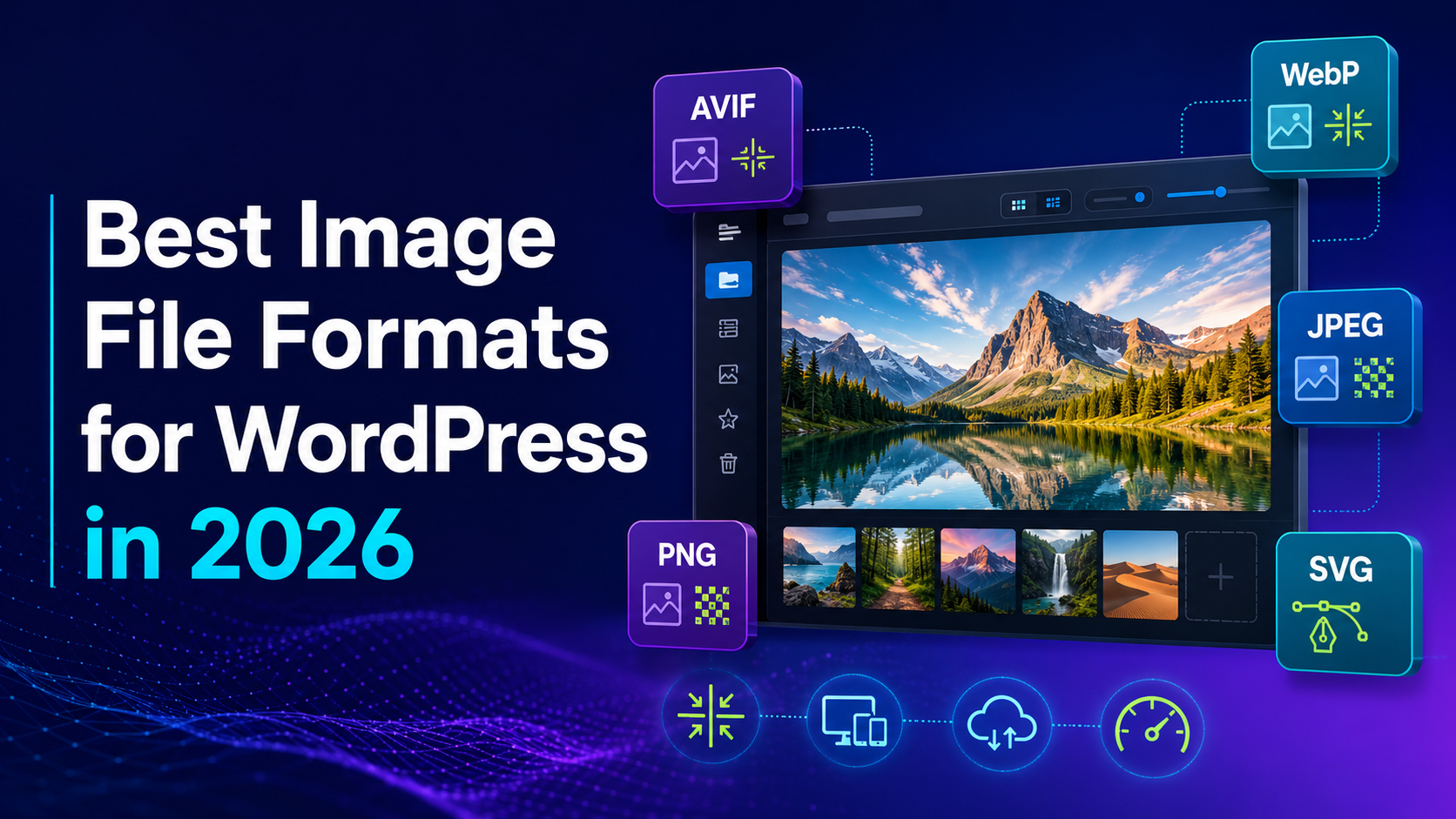
Choosing the right image format for WordPress is no longer limited to JPEG and PNG. Website owners can now use modern formats such as WebP and AVIF, along with SVG, GIF, and APNG. Each format handles compression, transparency, animation, image quality, and browser compatibility differently.
For most WordPress websites in 2026, WebP is a practical default because it offers efficient compression, broad browser support, transparency, and animation. AVIF can produce even smaller photographic files, although it may require more processing power and a reliable fallback workflow.
JPEG remains useful for photographs, social-sharing graphics, email images, and legacy compatibility. PNG works well for lossless screenshots and transparent raster graphics, while sanitized SVG is generally suitable for trusted logos, icons, diagrams, and scalable illustrations.
However, choosing the best image file formats for WordPress is only one part of image optimization. Images must also have appropriate dimensions, responsive variants, compression settings, loading priority, and caching. This guide compares the leading formats and explains how to create a faster, reliable WordPress image workflow.
Why Image Format Still Matters for WordPress Page Speed
An image format defines how visual information is stored inside a file and reconstructed by a browser. The format influences file size, visual quality, transparency, animation, color depth, compatibility, and processing requirements.
Every image used on a webpage must normally be downloaded before the visitor can see it. Larger files generally require more transfer time, especially on slower mobile networks.
This matters because images often represent a significant portion of the page’s total transferred data. A homepage may contain a large hero photograph, product cards, customer portraits, blog thumbnails, icons, and background graphics. Even when every file appears reasonable by itself, the combined image weight can become substantial.
Image Formats Influence Largest Contentful Paint
Largest Contentful Paint measures how quickly the largest visible content element appears within the viewport.
On many WordPress pages, this element is an image. Common examples include:
- A homepage hero photograph
- A blog featured image
- A WooCommerce product image
- A large promotional banner
- A portfolio cover image
- A course thumbnail
- A real estate property photograph
Google’s web performance guidance explains that images can become LCP candidates. Efficiently encoding a large image can therefore help reduce the time required to download and render it.
However, changing the file extension alone does not guarantee a faster LCP.
The result also depends on:
- Server response time
- CDN cache status
- Image dimensions
- Browser discovery
- Loading priority
- Responsive candidates
- Network speed
- Decoding time
- Render delay
- Theme and plugin behavior
An AVIF hero that is discovered late may appear after a smaller JPEG that the browser finds immediately.
A Small Saving Can Multiply Across a Page
WordPress rarely uses an uploaded image only once.
When an image is added to the Media Library, WordPress may create several intermediate sizes. Themes and plugins can register additional versions for specific layouts.
One uploaded photograph may produce:
- A thumbnail
- A medium image
- A medium-large image
- A large image
- A blog-card crop
- A mobile crop
- A featured-image version
- A WooCommerce thumbnail
- A gallery version
- A high-resolution version
The same attachment can then appear on the homepage, category archive, individual post, search page, related-content section, and social metadata.
This multiplies the impact of format decisions.
Suppose a product category page displays twelve photographs. Each JPEG weighs approximately 220 KB at the selected responsive size.
The image transfer would be:
12 × 220 KB = 2,640 KB
If equivalent WebP or AVIF versions average 140 KB, the image transfer becomes:
12 × 140 KB = 1,680 KB
The difference is approximately 960 KB for one category-page view.
The exact reduction will vary according to the images and settings. The example, nevertheless, shows why format optimization should be evaluated at page level rather than only one file at a time.
Image Formats Also Influence Visual Quality
The smallest file is not always the most appropriate file.
Lossy compression can remove details that matter to the user. Excessive compression may introduce:
- Blurred textures
- Damaged product labels
- Block artifacts
- Banding in gradients
- Halos around sharp edges
- Smudged interface text
- Unnatural skin tones
- Color shifts
- Rough transparent edges
These problems are particularly important for WooCommerce stores, photography portfolios, artwork galleries, software tutorials, diagrams, and images that contain small text.
The objective should not be to reduce every image to the lowest possible number of kilobytes.
A better objective is to create the smallest file that preserves the information and quality required for its purpose.
A category thumbnail can usually tolerate more compression than a full product-gallery image. A decorative background can use a different quality preset from a screenshot containing important instructions.
Format Decisions Affect Storage
Modern image workflows frequently retain several formats and widths.
A single upload might produce:
- One original JPEG
- Five JPEG responsive sizes
- Five WebP responsive sizes
- Five AVIF responsive sizes
- Several cropped versions
The website may deliver fewer bytes to visitors while storing more files in the Media Library or cloud bucket.
This is not necessarily a negative outcome. Storage and transfer solve different problems.
Object storage is often relatively affordable, while sending unnecessarily large images to every visitor can harm performance and increase bandwidth usage. However, the website team still needs a clear policy for:
- Original-file retention
- Responsive image sizes
- Derivative regeneration
- Backup
- Remote storage
- Local-file removal
- Media deletion
- CDN purging
- Migration
Conversion Requires Processing Resources
Modern image conversion is not free from a computational perspective.
JPEG and WebP generally encode quickly. AVIF may require more processing, especially when high-effort settings are used.
A small company website uploading a few images each month may never notice this difference. A marketplace, media publication, or WooCommerce store processing thousands of images might.
Large-scale websites may need:
- Background conversion queues
- Processing limits
- Conversion retries
- Logging
- Scheduled batch jobs
- Variant warming
- Resource monitoring
- Failure notifications
Processing time should not automatically disqualify AVIF. It simply needs to be included in the workflow decision.
Format Is Only One Part of Image Performance
A complete WordPress image strategy should also address:
- Correct dimensions
- Responsive image variants
- Compression quality
- Browser caching
- CDN delivery
- Lazy loading
- LCP priority
- Width and height attributes
- Alternative text
- Metadata
- Source preservation
- Mobile behavior
- Storage architecture
Converting an oversized JPEG to AVIF may reduce its file size, but sending a 3,000-pixel image into a 400-pixel mobile container still wastes data.
Similarly, moving a 4 MB PNG to cloud storage does not make it smaller. It only changes where the file is stored.
The strongest results come from combining suitable formats, correct dimensions, responsive delivery, and reliable caching.

JPEG Is Still Everywhere but No Longer the Only Default
JPEG is one of the most familiar image formats on the web. Its files commonly use .jpg or .jpeg.
The format applies lossy compression. This means some image information is discarded to create a smaller file.
JPEG works particularly well for photographs containing:
- Natural textures
- Gradients
- Shadows
- Skin tones
- Landscapes
- Many colors
- Soft transitions
The format remains widely compatible with browsers, editing applications, email clients, social platforms, content management systems, and older devices.
This compatibility means JPEG is not obsolete. Its role has simply changed as WebP and AVIF have become practical delivery formats.
How JPEG Compression Works
Photographs often contain more information than a viewer needs to perceive the image naturally at web dimensions.
JPEG compression reduces file size by representing parts of that visual information more efficiently and discarding selected details.
The chosen quality setting influences the balance between file size and appearance.
At a high-quality level, differences may be difficult to notice at normal viewing size. At an excessively low setting, the image may show:
- Blocks
- Rings around edges
- Smearing
- Color changes
- Loss of fine texture
The correct setting depends on the image.
A soft landscape may tolerate stronger compression than a watch photograph containing fine markings and reflective metal.
Where JPEG Still Works Well
JPEG remains practical for:
- Photographs without transparency
- Source files used to generate WebP and AVIF
- Blog featured images distributed to external systems
- Social-sharing graphics
- Email campaign images
- Downloadable photographs
- Product feeds
- Marketplace integrations
- Legacy websites
- Final compatibility fallbacks
JPEG is also easy to create and edit with almost every graphics application.
JPEG for Social Sharing
A WordPress webpage may serve AVIF or WebP to visitors while using a separate JPEG for Open Graph metadata.
This is often a sensible arrangement because social crawlers and external platforms may have different format requirements from modern browsers.
The image asset should generally be:
- Publicly reachable
- Large enough for a clear preview
- Properly cached
- Available without authentication
- Provided in a broadly supported format
- Free from hotlink restrictions that block crawlers
The format used inside the article does not need to match the social-sharing image.
JPEG for Email
Email clients are more fragmented than modern browsers.
Although some email environments may support modern formats, JPEG and PNG remain safer choices for broad campaign compatibility.
If a WordPress business sends a newsletter promoting a new blog article, it can use:
- AVIF or WebP on the website
- JPEG for the email preview
- JPEG or PNG for social sharing
One source image can generate several derivatives for different destinations.
JPEG Strengths
- Broad browser and application compatibility
- Fast encoding
- Fast decoding
- Strong support in design tools
- Effective for photographs
- Useful for email
- Useful for social sharing
- Dependable as a fallback
- Supports progressive encoding
JPEG Limitations
- No transparency
- No animation
- Usually larger than modern formats at similar perceived quality
- Can damage text and sharp edges
- Repeated recompression reduces quality
- Does not provide AVIF’s advanced color capabilities
- Less suitable for interface screenshots
JPEG and Repeated Editing
Every time a JPEG is opened, modified, and exported with lossy compression, more image information may be discarded.
This is known as generation loss.
Avoid using an already compressed website JPEG as the source for future edits. Preserve a high-quality master or original file.
A practical workflow is:
- Keep the master in the original editing format or as a high-quality export.
- Create website derivatives from the master.
- Never enlarge a small website derivative for another use.
- Regenerate new formats when the delivery requirements change.
Progressive JPEG
Progressive JPEG loads in several stages. A low-detail version may appear before the complete image finishes downloading.
This can improve perceived loading in some circumstances, especially on slow connections.
Progressive display does not automatically make JPEG more efficient than WebP or AVIF. It is simply one useful feature in the format’s mature ecosystem.
Practical WordPress Example
A travel website uploads a 2,400-pixel landscape photograph as a high-quality JPEG.
WordPress generates:
- 480-pixel version
- 768-pixel version
- 1,024-pixel version
- 1,440-pixel version
- 1,920-pixel version
The optimization system creates WebP and AVIF equivalents.
Modern browsers receive AVIF when appropriate. WebP is used as the next option, while JPEG remains the final fallback and social-sharing source.
JPEG continues to support the workflow without being the main delivered format.
PNG Is the Right Tool for Lossless Detail and Transparency
PNG uses lossless compression.
Unlike a lossy export, PNG does not discard represented pixel information to reduce file size. It can reconstruct the encoded pixels without compression damage.
PNG also supports alpha transparency, including partially transparent pixels.
These characteristics make it useful for images containing:
- Sharp lines
- Small text
- Interface controls
- Flat colors
- Transparent backgrounds
- Diagrams
- Pixel-based illustrations
They also make PNG inefficient for many photographs.
Where PNG Works Well
PNG is suitable for:
- Software screenshots
- Technical diagrams
- Transparent raster logos
- Product cutouts
- Instructional graphics
- Interface examples
- Simple illustrations
- Images requiring lossless editing
- Universal transparent fallbacks
The correct decision still depends on testing. Lossless WebP may produce a smaller file, while SVG may be more appropriate for genuinely vector-based content.
Why PNG Photographs Become Large
Photographs contain complex textures, colors, shadows, and gradients.
Lossless compression must preserve the represented pixel data. It cannot discard details that viewers are unlikely to notice.
A photographic PNG can therefore become much larger than a visually acceptable JPEG, WebP, or AVIF version.
This problem often begins with an innocent editorial workflow:
- An editor exports a photograph as PNG.
- The file is 3,000 pixels wide.
- The image weighs several megabytes.
- It is uploaded directly to WordPress.
- The article displays it at only 900 pixels.
- The same attachment appears on archive and related-content pages.
One unsuitable source can influence several templates.
PNG for Screenshots
Screenshots often contain small interface labels, thin borders, and flat color areas.
Aggressive JPEG compression may create visible artifacts around these elements. PNG can preserve them accurately.
However, PNG should not be used without checking dimensions.
A screenshot can be optimized by:
- Cropping irrelevant browser areas
- Removing unnecessary empty space
- Resizing close to the display width
- Removing private information
- Comparing PNG with lossless WebP
- Testing a high-quality lossy modern format
- Checking text at normal viewing size
PNG for Transparent Product Images
WooCommerce stores sometimes use transparent product cutouts so the background can adapt to the website design.
PNG provides dependable transparency, but complex high-resolution cutouts can become large.
A modern workflow can preserve a PNG master and generate:
- AVIF with alpha
- WebP with alpha
- PNG fallback
The transparent edges should be checked against white, dark, and actual website backgrounds.
PNG Strengths
- Lossless compression
- Full alpha transparency
- Strong reproduction of text
- Good for screenshots
- Good for diagrams
- Broad compatibility
- Mature editing support
- Dependable fallback
PNG Limitations
- Large photographic files
- High storage usage at large dimensions
- Does not scale like SVG
- Frequently larger than lossless WebP
- Can be used unnecessarily for decorative graphics
- Expensive when many responsive sizes are generated
PNG Versus Lossless WebP
Lossless WebP can often store the same raster content more efficiently than PNG.
That does not mean every PNG should be deleted immediately.
Compare both formats using:
- Identical dimensions
- Identical transparency
- Normal display size
- Actual file size
- Browser support requirements
- Editing requirements
- Third-party compatibility
If lossless WebP provides the same visible result with fewer bytes, it can be used for website delivery while the PNG remains available as a source or fallback.
WebP Is the Safe and Practical Modern Default
WebP is a versatile image format originally developed by Google.
It supports:
- Lossy compression
- Lossless compression
- Transparency
- Animation
This allows WebP to perform jobs traditionally divided among JPEG, PNG, and GIF.
WebP is supported by modern browsers and has a mature website ecosystem. It can be processed by many WordPress plugins, CDNs, optimization services, and hosting environments.
Why WebP Works Well for WordPress
WordPress website owners often need a format that improves efficiency without creating an overly complex publishing process.
WebP fits that requirement because it can handle:
- Blog photographs
- WooCommerce product images
- Transparent graphics
- Screenshots
- Featured images
- Thumbnails
- Short animation
- Decorative backgrounds
A team can adopt WebP as one modern delivery format rather than maintaining a complex format stack manually.
Lossy WebP for Photographs
Lossy WebP is suitable for:
- Product photography
- Travel photographs
- Food images
- Portraits
- Real estate listings
- Blog featured images
- Category thumbnails
- Decorative hero backgrounds
The encoder discards selected visual information to reduce file size.
Quality should be tested against real content. A setting that looks acceptable for landscapes may damage:
- Fine jewelry
- Product labels
- Clothing texture
- Hair
- Skin
- Small lettering
Use representative images when creating a preset.
Lossless WebP for Screenshots and Graphics
Lossless WebP can be suitable for:
- Interface screenshots
- Transparent raster icons
- Diagrams
- Simple illustrations
- Product cutouts
It may produce smaller files than PNG while preserving the encoded pixels.
For logos and geometric icons, sanitized SVG may remain more appropriate because it scales without relying on fixed pixel dimensions.
Animated WebP
Animated WebP provides animation with richer color and more modern compression than traditional GIF.
It can work well for:
- Short interface demonstrations
- Product interactions
- Decorative loops
- Small tutorial snippets
- Reaction graphics
For longer sequences, video is usually more efficient and accessible.
A video can provide:
- Play and pause controls
- Captions
- Audio
- Seeking
- Better compression
- Reduced-motion alternatives
WebP Browser and Tool Support
Current major browsers support WebP.
Compatibility concerns may still arise outside ordinary webpage delivery, including:
- Old image editors
- Legacy content systems
- Email clients
- Social platforms
- Marketplace feeds
- Desktop download workflows
This is why a website may serve WebP to browsers while retaining JPEG or PNG derivatives for external uses.
WebP Strengths
- Lossy and lossless modes
- Alpha transparency
- Animation
- Broad modern-browser support
- Efficient compression
- Faster encoding than many AVIF configurations
- Mature WordPress support
- Practical AVIF fallback
- One format can cover several content types
WebP Limitations
- AVIF may produce smaller photographic files
- Some external applications prefer JPEG or PNG
- Poor settings can damage quality
- Legacy software may not open WebP
- Transcoding cannot restore lost source detail
- Animated WebP may not replace video for longer content
When WebP Is the Best Operational Choice
Use WebP as the main format when:
- You want one modern raster format
- The audience uses current browsers
- The server supports reliable WebP processing
- Encoding speed matters
- The workflow should remain simple
- Transparency is required
- The CDN or plugin can generate variants automatically
WebP is also a strong fallback when AVIF is served first.
AVIF Provides Excellent Compression for Modern Delivery
AVIF is based on AV1 image coding technology.
It supports:
- Lossy compression
- Lossless compression
- Alpha transparency
- Animation
- High dynamic range
- Wide color gamut
- Higher color depth
AVIF is designed to store detailed visual information efficiently.
According to the Web Platform Baseline project, AVIF has been supported by all core browsers since January 2024. In 2026, it is practical for modern browser delivery.
Fallbacks may still be useful for old clients, embedded browsers, social crawlers, email applications, and external services.
Why AVIF Can Produce Smaller Images
AVIF uses advanced compression techniques derived from the AV1 video codec.
It can often preserve similar perceived quality with fewer bytes than JPEG and, in many cases, WebP.
However, results depend on:
- Encoder implementation
- Quality target
- Effort setting
- Image content
- Chroma settings
- Transparency
- Bit depth
- File dimensions
Avoid promising that every AVIF file will be a fixed percentage smaller. Measure representative images.
AVIF for Photography-Heavy Websites
AVIF is especially relevant for:
- Photography portfolios
- WooCommerce catalogs
- Property listings
- News publications
- Travel websites
- Food blogs
- Fashion stores
- Image-heavy landing pages
- User-generated galleries
A modest saving per image can become important when many images appear on one page.
AVIF and Perceived Quality
AVIF can preserve gradients, textures, transparency, and advanced color information efficiently.
It can still develop artifacts when overcompressed.
Possible problems include:
- Smoothed texture
- Color changes
- Banding
- Damaged edges
- Missing small details
- Unnatural skin
- Soft product text
Review the image at normal display size before examining it at extreme zoom.
If an artifact changes the information communicated by the image, increase quality or use another format.
AVIF Encoding Time
AVIF may require more CPU time than JPEG or WebP.
This matters for websites that:
- Generate images during page requests
- Process large media libraries
- Run on limited shared hosting
- Handle user uploads
- Build many responsive variants
- Publish at high volume
Possible solutions include:
- Background processing
- Scheduled batch conversion
- Queue limits
- Conversion retries
- Managed image services
- CDN transformation
- Pre-generation
- Long-lived caching
Visitors should not repeatedly wait for expensive conversion. Once a derivative is generated, it should normally be cached and reused.
AVIF Strengths
- Excellent compression for many photographs
- Lossy and lossless modes
- Transparency
- Animation
- Modern browser support
- High dynamic range
- Wide color
- Valuable transfer savings at scale
AVIF Limitations
- Higher encoding cost
- Some legacy clients lack support
- Some editing tools have limited support
- Social and email workflows may need JPEG or PNG
- More formats increase storage complexity
- Poor settings can damage fine details.
- Dynamic generation may delay first requests
When AVIF Should Be Served First
AVIF is a strong first source when:
- Conversion is automated
- Fallbacks are generated
- Variants are cached
- The site contains many photographs
- File transfer affects performance
- The team can test quality
- The hosting or image service handles processing reliably
A small WordPress business website may prefer the simplicity of WebP alone. A large WooCommerce store or publication may benefit from AVIF first, WebP second, and JPEG or PNG last.
JPEG vs PNG vs WebP vs AVIF Compared
Each format solves a different problem.
| Format | Type | Compression | Transparency | Animation | Typical use |
| AVIF | Raster | Lossy and lossless | Yes | Yes | Efficient modern photographs |
| WebP | Raster | Lossy and lossless | Yes | Yes | Practical modern default |
| JPEG | Raster | Lossy | No | No | Photography and compatibility |
| PNG | Raster | Lossless | Yes | APNG variant | Screenshots and transparent graphics |
| SVG | Vector | Vector instructions | Yes | Possible | Trusted logos and icons |
| GIF | Raster | Palette-based | Basic | Yes | Legacy animation |
| APNG | Raster | Lossless | Yes | Yes | Lossless animation |
| TIFF | Raster | Commonly lossless | Optional | No | Print and editing |
| BMP | Raster | Often uncompressed | Limited | No | Legacy sources |
Recommended Format by WordPress Asset
| Asset | Recommended format | Fallback |
| Hero photograph | AVIF or WebP | WebP or JPEG |
| Product photograph | AVIF or WebP | WebP or JPEG |
| Screenshot | Lossless WebP or PNG | PNG |
| Transparent product cutout | AVIF or WebP with alpha | PNG |
| Logo | Sanitized SVG | PNG |
| Simple icon | Sanitized SVG | PNG |
| Detailed illustration | AVIF or WebP | PNG or JPEG |
| Short animation | Animated WebP or AVIF | GIF |
| Long tutorial | Video | Poster image |
| Social image | JPEG or PNG | Same file |
| Email image | JPEG or PNG | Same file |
| Print master | TIFF or PDF | JPEG preview |
Lossy Versus Lossless
Lossy compression removes selected information to reduce file size.
It is suitable for:
- Photographs
- Complex illustrations
- Decorative images
- Thumbnails
- Backgrounds
Lossless compression preserves the encoded pixel information.
It is suitable for:
- Screenshots
- Diagrams
- Text-heavy graphics
- Transparent interface assets
- Files requiring future editing
Raster Versus Vector
JPEG, PNG, WebP, AVIF, and GIF are raster formats. They store pixels at fixed dimensions.
SVG is a vector format. It stores drawing instructions.
Use raster formats for photographs and complex pixel-based artwork. Use vector formats for geometric artwork that must scale.
PNG vs JPEG and When to Use Each One
The PNG versus JPEG comparison remains useful, even though modern formats now provide additional options.
The basic rule is
- Use JPEG for photographs without transparency.
- Use PNG for transparent raster images, screenshots, diagrams, and sharp text.
Choose JPEG When
- The image is photographic
- It contains many colors
- It contains natural texture
- Transparency is unnecessary
- File size matters
- The image will appear in email
- The image will appear on social media
- A legacy fallback is needed
Choose PNG When
- Transparency is necessary
- The image contains small text
- Sharp edges must remain clear
- The file is a screenshot
- The image is a diagram
- Lossless preservation is required
- JPEG artifacts would reduce clarity
Consider WebP or AVIF When
- The destination is a modern browser
- The site can generate fallbacks
- A PNG screenshot is too large
- A JPEG photograph can be compressed further
- A transparent raster asset needs more efficient delivery
- The image pipeline supports automatic conversion
How to Implement a Multi-Format Strategy
Selecting the format is only half of the process. The website must generate, reference, cache, and deliver each file correctly.
Step 1: Audit the Media Library
Identify images with the greatest performance impact.
Record:
- File format
- File size
- Dimensions
- Display size
- Page usage
- Mobile behavior
- LCP status
- Cache headers
- Loading priority
- CDN hostname
- Responsive candidates
Prioritize high-traffic pages and large above-the-fold images.
Step 2. Categorize the Images
Create rules based on content.
- Photos use AVIF or WebP
- Screenshots use lossless WebP or PNG
- Logos use sanitized SVG
- Transparent raster images use AVIF or WebP with PNG fallback
- Social images use JPEG or PNG
- Email graphics use JPEG or PNG
- Long animations use video
Step 3. Preserve Originals
Keep a suitable source for regeneration.
Delivery derivatives should not be the only remaining copy of an important image.
Preserve:
- Original photographs
- Design-source files
- Vector logos
- Lossless screenshot masters
- Print files
- Required metadata
Step 4. Generate Responsive Dimensions
Create widths that match real layouts.
Possible candidates include:
- 480 pixels
- 768 pixels
- 1,024 pixels
- 1,440 pixels
- 1,920 pixels
Avoid creating numerous unused sizes without considering processing and storage.
Step 5. Test Quality Presets
Do not use one compression setting blindly.
Test:
- Bright photographs
- Dark photographs
- Skin
- Fine texture
- Product labels
- Screenshots
- Transparent edges
- Logos
- Small thumbnails
Quality values are not standardized across formats.
Step 6. Use Correct Markup
A simplified format stack can use <picture>:
<picture>

  <source

    type="image/avif"

    srcset="image-640.avif 640w, image-1280.avif 1280w"

    sizes="(max-width: 720px) 100vw, 1200px">

  <source

    type="image/webp"

    srcset="image-640.webp 640w, image-1280.webp 1280w"

    sizes="(max-width: 720px) 100vw, 1200px">

  <img

    src="image-1280.jpg"

    srcset="image-640.jpg 640w, image-1280.jpg 1280w"

    sizes="(max-width: 720px) 100vw, 1200px"

    width="1280"

    height="720"

    alt="A person preparing products for an online store">

</picture>
The browser selects the first supported source and an appropriate responsive width.
Step 7. Protect the LCP Image
Do not lazy-load a hero image that appears immediately.
Make sure it is:
- Present in the initial HTML
- Discoverable early
- Correctly sized
- Efficiently encoded
- Served from cache when possible
- Not delayed by JavaScript
Use high fetch priority only for genuinely critical images.
Step 8. Lazy-Load Lower Images
Images below the first viewport can use native lazy loading.
Avoid loading an entire product gallery, portfolio, or archive immediately when only a few images are visible.
Step 9. Configure Browser and CDN Caching
Static image variants should use effective cache headers and stable URLs.
If a CDN negotiates formats, verify that its cache separates responses correctly.
Check:
- Content-Type
- Cache status
- Cache key
- Accept handling
- Purging behavior
- Custom domain
- TLS
- Origin permissions
Step 10. Consider Media Offloading
Cloud media storage can support large WordPress libraries and separate assets from application hosting.
Next3 Offload can be evaluated as one option for WordPress media offloading and image optimization. It may fit websites that need to connect the media library with supported cloud storage and modern delivery workflows.
The decision should be based on:
- Provider support
- Current optimization features
- Responsive image behavior
- CDN compatibility
- URL rewriting
- Backup
- Migration
- Deletion behavior
- Local-file retention
Media offloading does not automatically correct oversized dimensions or poor compression.
Step 11. Test on Staging
Test a representative group of pages:
- Homepage
- Blog article
- Archive
- Product page
- Product category
- Gallery
- Search page
- Multilingual version
- Mobile layout
Confirm that all modern and fallback files work.
Step 12. Convert in Batches
Do not convert and delete an entire mature media library in one operation.
Process a small group, inspect the results, and keep a conversion log.
Preserve originals until
- Front-end pages are tested
- Caches have refreshed
- Integrations are verified
- Backups are confirmed
- A rollback process exists
Step 13. Verify the Live Browser Response
Use developer tools to inspect:
- Downloaded format
- Dimensions
- Content type
- Transferred bytes
- Loading priority
- Cache status
- Responsive selection
- Request timing
Do not assume that a plugin setting guarantees the expected browser response.
Step 14. Monitor Field Performance
Review real-user performance after the deployment.
A laboratory test shows one controlled page load. Field data reflects real visitors, devices, networks, and cache conditions.
What Businesses Commonly Get Wrong
The most common problem is not always selecting the wrong format. It is treating image optimization as a one-time task.
Browser support, WordPress capabilities, CDN services, and image encoders continue to develop. A policy created several years ago may no longer be efficient.
Using One Setting for Every Image
Product photographs, screenshots, logos, and animations have different needs.
Create a few content-based presets rather than one universal rule.
Optimizing the Original but Not the Delivered Size
Visitors frequently receive WordPress intermediate sizes rather than the original attachment.
Make sure every relevant derivative is processed.
Ignoring Mobile Dimensions
A format may be efficient while the selected file is still much wider than the mobile container.
Inspect actual mobile requests.
Treating Cloud Storage as Compression
Object storage changes file location.
It does not reduce dimensions or encoding size.
Removing Originals Too Early
Originals support:
- Regeneration
- Editing
- Migration
- Rollback
- Higher-quality future encoders
Do not delete them until the workflow is proven and recoverable.
Ignoring External Destinations
Email clients, social platforms, feeds, and marketplaces may need JPEG or PNG even when the website uses AVIF.
Create destination-specific derivatives.
Enabling Unsafe SVG Uploads
SVG is useful but must be sanitized.
Do not allow unrestricted uploads from untrusted users.
Focusing Only on a Performance Score
A higher test score does not justify unreadable screenshots, damaged product labels, or inaccurate color.
Performance and visual usefulness must be balanced.

WordPress Image Optimization Checklist
Source Preparation
- Preserve a clean master
- Avoid repeated lossy exports
- Crop unnecessary areas
- Review private metadata
- Confirm orientation
- Check color
Format Selection
- Use AVIF or WebP for photographs
- Use lossless WebP or PNG for screenshots
- Use sanitized SVG for trusted vector graphics
- Keep compatible social and email derivatives
- Test transparent edges
- Avoid PNG photographs
- Avoid JPEG logos
Responsive Delivery
- Generate appropriate widths
- Verify srcset
- Verify sizes
- Check mobile downloads
- Add width and height
- Use art-directed crops where necessary
Loading
- Do not lazy-load the likely LCP image
- Lazy-load below-the-fold imagery
- Avoid prioritizing too many images
- Check image discovery
- Reduce gallery requests above the fold
Storage and CDN
- Preserve originals
- Verify offload synchronization
- Test CDN caching
- Confirm content types
- Test fallback behavior
- Document deletion rules
- Maintain a rollback path
Quality and Accessibility
- Review images at normal display size
- Check text readability
- Check transparent edges
- Use meaningful alternative text
- Keep essential text in HTML
- Provide video controls for long animations
FAQ
1. What are the best image file formats for WordPress?
WebP is the most practical format for most WordPress images. AVIF is suitable when smaller photographic files are the priority. Use PNG for lossless screenshots and transparent graphics, JPEG for compatibility, and sanitized SVG for logos and icons.
2. Is WebP or AVIF better for WordPress?
WebP offers broad compatibility, fast encoding, transparency, and efficient compression. AVIF often creates smaller photographic files but may require more processing. Websites with automatic fallback support can serve AVIF first and WebP second.
3. Is WebP better than JPEG for WordPress images?
WebP generally produces smaller files than JPEG at comparable visual quality. It also supports transparency and animation. JPEG remains useful for social images, email graphics, downloads, external feeds, and compatibility fallbacks.
4. Should I use PNG or JPEG for my website?
Use JPEG for photographs that do not need transparency. Use PNG for screenshots, diagrams, transparent raster graphics, and images containing sharp text. WebP or AVIF may provide smaller alternatives for browser delivery.
5. Does using WebP or AVIF improve WordPress SEO?
WebP and AVIF do not create a direct ranking advantage. However, their smaller file sizes can support faster image loading and better largest contentful paint. Image SEO also depends on responsive sizing, descriptive alt text, caching, and relevant surrounding content.
6. Can Next3 Offload convert and deliver WordPress images?
Next3 Offload can be considered part of a WordPress media offloading and image optimization workflow. It can help connect the media library with supported cloud storage and modern image delivery. Correct dimensions, responsive markup, compression settings, and backups are still necessary.
Conclusion
WebP is the most practical modern default for many websites because it combines efficient compression, transparency, animation, broad browser support, and manageable processing requirements.
AVIF is a strong first delivery format for photography-heavy websites, WooCommerce catalogs, portfolios, property listings, and publications that can automate conversion and fallback delivery.
JPEG remains useful for source photography, email graphics, social-sharing images, downloads, feeds, and legacy compatibility.
PNG continues to serve an important role for lossless screenshots, text-heavy diagrams, and transparent raster fallbacks. Sanitized SVG is normally the right choice for trusted logos, icons, and simple scalable graphics.
The most effective WordPress image strategy also accounts for dimensions, responsive sources, quality settings, loading priority, caching, compatibility, and source preservation.
Image optimization, CDN delivery, and media offloading should be understood as related but separate layers.
Optimization reduces file dimensions or encoding size. A CDN caches and distributes files. Media offloading changes where WordPress media is stored.
For a growing media library, Next3 Offload can be considered as part of a WordPress cloud-storage and image-delivery workflow. Its relevance is practical rather than promotional. Offloading can support media management and distribution, but it does not replace suitable formats, responsive markup, appropriate dimensions, or performance testing.
Start with the pages receiving the most traffic. Measure the existing image transfer, test representative formats, preserve the originals, deploy changes in batches, and confirm what browsers actually download.
That evidence-based process will produce a more reliable WordPress image workflow than converting every attachment to one format without considering its purpose.






Comments
Congratulations, you have the opportunity to be the first commenter on this article.
Have a question or suggestion? Please leave a comment to start the discussion.